
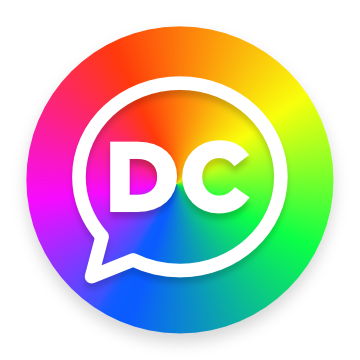

Today we’re introducing a whole host of changes to the look and feel of dccma.com that we’re really excited about. First is a new logo. For the first time we are including a horizontal version of the familiar ‘stacked’ design we’ve been using since 2020. Additionally we have transitioned away from gradients to a unified flat design aesthetic for all instances of the logo. But the biggest change here is the “M” which incorporates an abstract representation of two people holding hands. This reflects our mission: to reach the addict who still suffers with connection, love and friendship. It’s a small change with a big meaning that we think looks just great.

Since 2020, we have used bright blue as the primary color for our logo and various UI elements like buttons and the footer background. Today, we are moving to a darker, more saturated blue that increases readability on any screen size while keeping with current design trends. Throughout the site, we continue to emphasize white space to keep the UI clean and friendly. We have rolled out a fresh light gray color for certain sections of the UI such as page backgrounds and the title bar. This helps the logo and other clickable items stand out, lessening visual noise and calming the design down a bit. With an emphasis on lighter tones for background elements and saturated, darker tones for interactive elements, we can better guide the user to actionable parts of the site. Ultimately this leads to quicker access to information and a better user experience.
The user interface throughout the site has been adjusted in size with larger type, more spacious padding around elements, increased header logo size, and a simplified mega menu navigation. Additionally, corner radiuses have been made globally rounder for elements such as buttons and information cards. We have also refined our responsive mobile and tablet layouts to better scale on those devices. Transitions between states have been made shorter to increase the feeling of UI snappiness. We have reintroduced softer shadows for the header and card elements and will continue to roll out shadows to elements where it makes sense. Flat design principals remain the preferred mode for most content on the site with a mixture of dimensional elements when necessary to accentuate depth or to call attention.
Beginning with the homepage and Intergroup pages, we are rolling out more Lottie animations across the site. Motion scrolling elements have been added to the ‘New to CMA?’ page as well as the homepage. Moving forward, we want to use motion elements to better support our mission but not distract from the information being displayed. A ‘less is more’ approach. We love restraint (though sometimes it’s hard!)
There is a lot in the pipeline this year for the site. We will be launching the MARCMA page in the coming months and restyling a number of pages to better align with our new aesthetic. On the backend we will continue to optimize content and plugins for faster page loads. There’s a lot to be excited about and we are grateful to support our thriving ecosystem of in-person, online and hybrid meetings with relevant content and great design.
TRIANGLE CLUB
1638 R St NW Washington, DC 20009 — with the “red door”
DUPONT CIRCLE CLUB
1623 Connecticut Avenue, NW Washington, DC 20009 — second floor
EMMANUEL EPISCOPAL CHURCH
811 Cathedral Street Baltimore, MD 21201 — enter on W. Read Street
IN OTHER CITIES
World-wide CMA meeting search: crystalmeth.org
For general inquiries about CMA in DC, Maryland and Northern Virginia contact:
[email protected]
For CMA services worldwide:
crystalmeth.org
We have in-person, online and hybrid meetings 7 days a week at multple times each day. See our Meetings page for more information
0.2.10
0.2.9
0.2.8
0.2.7
0.2.6
0.2.5
0.2.4
0.2.3
0.2.2
0.2.1
0.2.0
0.1.10
0.1.9
0.1.8
0.1.7
0.1.6
0.1.5
0.1.4
0.1.3
0.1.2
0.1.1
0.1.0