Serving Washington DC, Maryland, Northern Virginia and Online Worldwide

Join the chat
Learn more
DC CMA is on WhatsApp — Learn more
Designlog
Official blog of the Public Information Committee

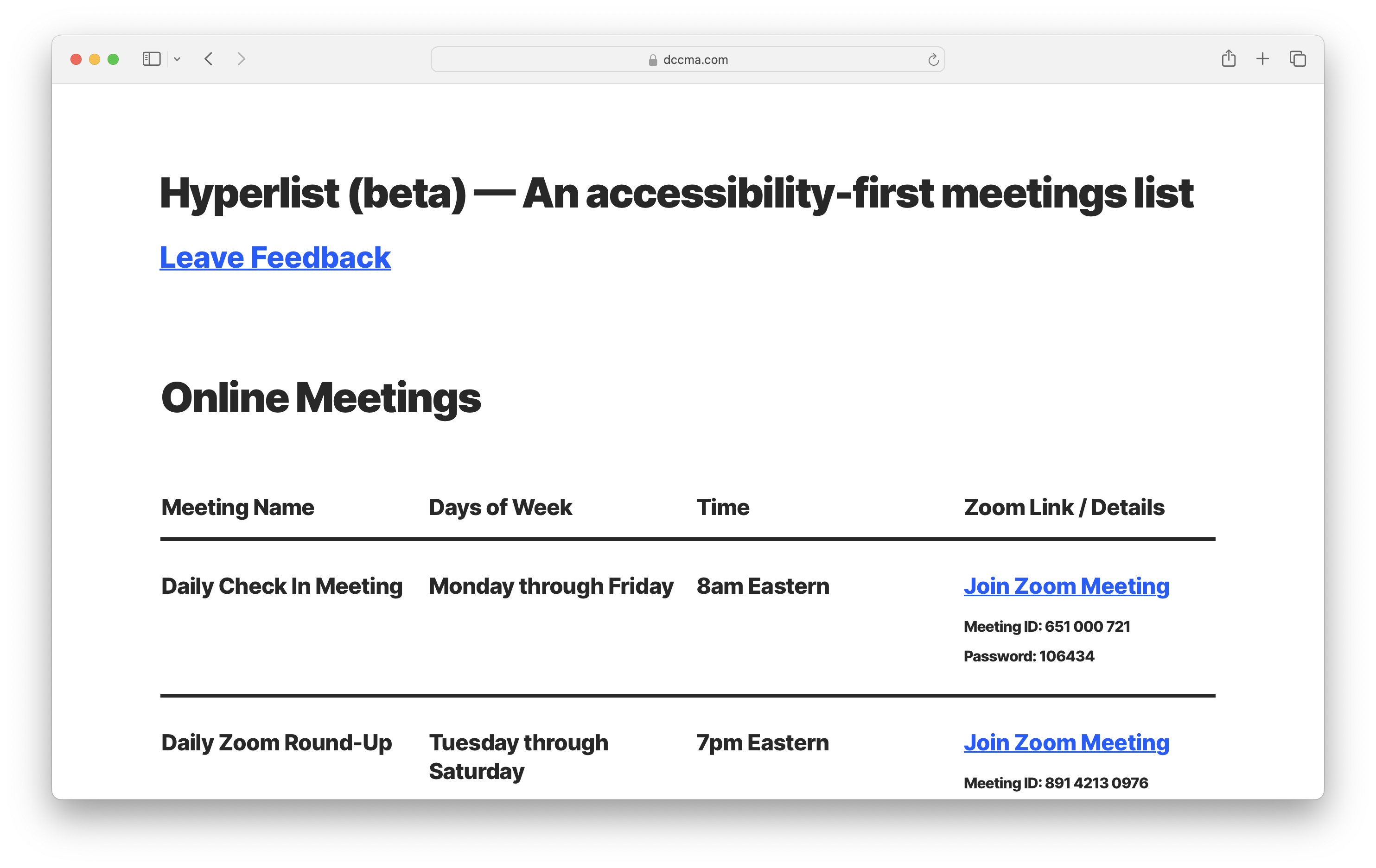
Today we are pleased to introduce a new beta feature we’re calling Hyperlist: an accessibility first meetings list specifically designed for ease of access and readability for users with visual impairments. Our existing card-based interfaces such as those on the Online Meetings or Meetings beta pages present challenges for users who rely on voice tools such as Apple’s VoiceOver or Microsoft’s Narrator. Hyperlist is an answer to those challenges. You can access Hyperlist by clicking the navigation link at the top left of the header (or on top of the header on mobile) . This is positioned to be the very first link for users when using voice navigation, easing access.

The structure of the page has been designed to facilitate clearer page navigation with meeting names, days of the week, meeting times and details uniformly structured line by line for better navigation with voice tools. The text is a bold sans-serif sized using REM units that easily scale up or down based on the user’s base font size setting in-browser. The layout also shifts for clear mobile viewing as well.

As with all beta features, we encourage our users to send us their feedback. We think Hyperlist is a great addition to dccma.com and look forward to improving it and all our beta features into 2024.
A faster way to find meetings on dccma.com

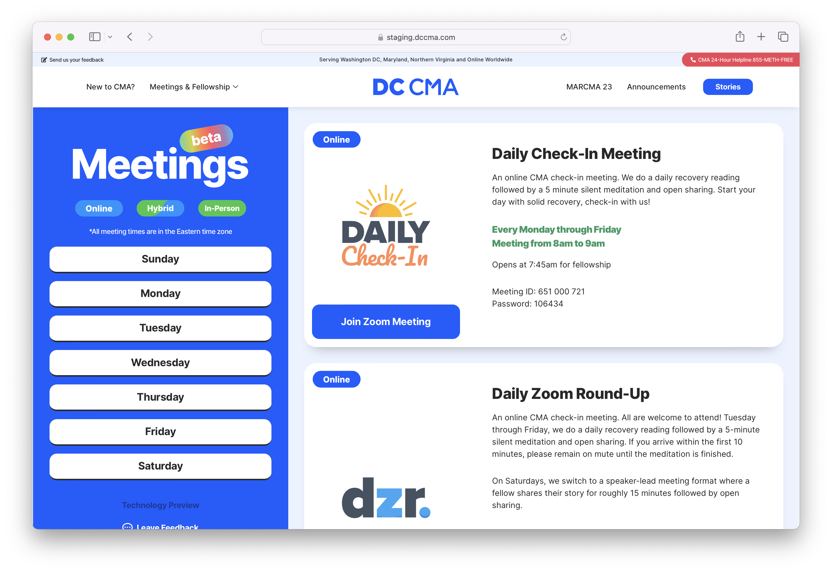
Today we’re introducing Meetings beta, an all new way to quickly and effortlessly find your next meeting on dccma.com. This technology preview will eventually become the primary way to browse our meeting directory and we’re really excited to launch it in beta form today. Simply navigate to dccma.com/meetings-beta, click on a weekday in the blue bar and that day’s meetings will dynamically populate from the right in chronological order. It’s that easy.

Our existing In-Person and Online meeting pages will remain unchanged until this page has come out of beta. We encourage all our users to try out the beta interface and leave us feedback. Become part of the process! Simply click the Leave Feedback link under the weekday buttons to get involved.

We think Meetings beta is going to improve user experience dramatically and we’re excited to see it put into service.

Today we’re introducing a whole host of changes to the look and feel of dccma.com that we’re really excited about. First is a new logo. For the first time we are including a horizontal version of the familiar ‘stacked’ design we’ve been using since 2020. Additionally we have transitioned away from gradients to a unified flat design aesthetic for all instances of the logo. But the biggest change here is the “M” which incorporates an abstract representation of two people holding hands. This reflects our mission: to reach the addict who still suffers with connection, love and friendship. It’s a small change with a big meaning that we think looks just great.

Color Schema

Since 2020, we have used bright blue as the primary color for our logo and various UI elements like buttons and the footer background. Today, we are moving to a darker, more saturated blue that increases readability on any screen size while keeping with current design trends. Throughout the site, we continue to emphasize white space to keep the UI clean and friendly. We have rolled out a fresh light gray color for certain sections of the UI such as page backgrounds and the title bar. This helps the logo and other clickable items stand out, lessening visual noise and calming the design down a bit. With an emphasis on lighter tones for background elements and saturated, darker tones for interactive elements, we can better guide the user to actionable parts of the site. Ultimately this leads to quicker access to information and a better user experience.

UI Proportions and Style Changes

The user interface throughout the site has been adjusted in size with larger type, more spacious padding around elements, increased header logo size, and a simplified mega menu navigation. Additionally, corner radiuses have been made globally rounder for elements such as buttons and information cards. We have also refined our responsive mobile and tablet layouts to better scale on those devices. Transitions between states have been made shorter to increase the feeling of UI snappiness. We have reintroduced softer shadows for the header and card elements and will continue to roll out shadows to elements where it makes sense. Flat design principals remain the preferred mode for most content on the site with a mixture of dimensional elements when necessary to accentuate depth or to call attention.

Motion Design

Beginning with the homepage and Intergroup pages, we are rolling out more Lottie animations across the site. Motion scrolling elements have been added to the ‘New to CMA?’ page as well as the homepage. Moving forward, we want to use motion elements to better support our mission but not distract from the information being displayed. A ‘less is more’ approach. We love restraint (though sometimes it’s hard!)

Looking Forward

There is a lot in the pipeline this year for the site. We will be launching the MARCMA page in the coming months and restyling a number of pages to better align with our new aesthetic. On the backend we will continue to optimize content and plugins for faster page loads. There’s a lot to be excited about and we are grateful to support our thriving ecosystem of in-person, online and hybrid meetings with relevant content and great design.

Made with love & serenity
DC CMA Logo
Ver. 0.2.10
Changelog

0.2.10

  • Fixed permission issue on Meetings beta page
  • Removed online meetings from In-Person Meetings page
  • Changed URL of In-Person Meetings page to /inperson
  • Changed URL of Meetings beta page to /meetings and created redirect


0.2.9

  • Performance optimization
  • Depreciated Calendar
  • Minor layout fixes
  • Added Hyperlist page
  • Changed single announcements post layout to horizontal card


0.2.8

  • Removed sticky header
  • Fixed announcements loop mobile layout


0.2.7

  • Introduced Meetings beta page


0.2.6

  • Introduced horizontal announcement cards for homepage and announcements page
  • Added webmail link to Site Index and Intergroup page
  • Minor layout fixes


0.2.5

  • Added MARCMA page
  • Fixed tablet layout issues on header
  • Moved “Posted On” date to the bottom of the announcement cards
  • Minor adjustments to elements


0.2.4

  • Expanded header and footer to full width on desktop
  • Centered logo on header and repositioned menus on desktop
  • Incorporated mega menu trigger into logo
  • Introduced new full width footer
  • Created Site Index slide-in
  • Revised Changelog slide-in
  • Refreshed Stories page and implemented Loop Grid queries
  • Minor layout fixes


0.2.3

  • Minor layout fixes
  • Standardized heading fonts H1 through H6 for uniformity
  • Transitioned more text elements to REM
  • Added CMA Fellowships Directory page
  • Fixed mobile menu 


0.2.2

  • Introduced new horizontal logo design and enlarged proportions on header
  • Thinned header
  • Recolored the title bar above header to pale gray
  • Introduced new color schema throughout site with more bold, contrasting colors against neutral backgrounds
  • Restyled New to CMA? page
  • Introduced new Intergroup logo with Lottie animation
  • Simplified homepage layout
  • Introduced design blog
  • Set button border radius to 15px site-wide


0.2.1
 

  • Replaced homepage slider with new hero design
  • Added Lottie animations
  • Added change log page
  • Implemented Loop Builder for queried posts
  • Redesigned announcements carousel on homepage
  • Redesigned announcements archive pages with infinite scroll
  • Minor fixes to layouts
  • Unified button color schema
  • Optimized database
  • Removed old page revisions for performance


0.2.0

  • New header layout
  • Implemented mega menu
  • Recolored major elements with more saturated hues
  • Homepage redesign with scrolling clouds motion at footer
  • Footer condensed and restyled
  • Added Daily Check-In page


0.1.10

  • Restyled Newcomer page with cloud graphics
  • Changed name to ‘New to CMA?’


0.1.9

  • Added Stories pages
  • Configured Stories category and blog query


0.1.8

  • Header rescaled and added background blur


0.1.7

  • Added Elections page


0.1.6

  • Added Online meetings page


0.1.5

  • Homepage refresh
  • Added Announcements carousel


0.1.4

  • Added Dual-Diagnosis page


0.1.3

  • Added Newcomer page


0.1.2

  • Introduced card-styled elements throughout site
  • Complete restyling of Meetings page with card-centric layout


0.1.1

  • Container reduced to 1140px
  • Header resized and  boxed


0.1.0

  • Initial release
Made with love & serenity